Over the last few years, I’ve spent a lot of time at the intersection of complex business data and custom business software. Building version one of the Icehouse Ventures investor portal meant taking financial data that had lived in Excel and Microsoft Access for years and turning it into a database that could power real software.
The gap between a random spreadsheet and “structured data” is bigger than most people realise. Excel is a magical tool for financial analysis but it’s not really designed to be a database, CRM or layout tool. Yet somehow all of use have reached for Excel (or Google Sheets) as a project management timeline, customer list, RSVP tracker or product requirements list. It’s fast, has just enough structure (rows and columns) and just enough flexibility (colours, borders and headings).
The problems I’ve run into most when being handed someone else’s spreadsheet aren’t really complexity problems. They’re habits and hygiene. Practices that are completely sensible to the person who built the spreadsheet, but completely invisible to the poor analyst, engineeer or agent that has to process it. Here are the common spreadsheet habits that have caused me the most pain.
Colour as Data
It’s the most natural thing in the world to slap colour on a spreadsheet when you are in a hurry. Red text for overdue. Green cells for approved. Yellow for someone-needs-to-follow-up. It looks clean. It communicates at a glance. The problem is that colour lives in the formatting layer, not the data layer. When someone has to export your spreadsheet to CSV, or push it through an API, or feed it to an AI agent the colour is gone. Whatever you were communicating with it disappears.
The simple fix is an explicit column. If red means “Overdue”, add a Status column and write “Overdue”. It’s a bit more typing upfront and a lot less confusion downstream.
Layout as Meaning
This one is more subtle. You have a list of transactions and instead of repeating “Q1 2024” on every row, you put it as a bold sub-heading (with a nice horizonal row underline to break things up) above the relevant rows. Visually? Elegant. Semantically? A problem. Here’s a test: if someone innocently re-sorted your spreadsheet alphabetically before it was handed to your tech team, would the sheet lose information? If the answer is yes, your data is broken.
Meaning has to survive re-sorting. A nice subheading that provides the only context for all the grouped rows below it doesn’t survive. The rows scatter, the heading stays put, and the relationship is gone. (And don’t get me started on merged cells and indentations across columns.) The fix again is a simple additional column. Repeat the category value on every row. It looks redundant. But it isn’t. That’s just what tidy data looks like.
Hiding Things
Excel’s “hide” feature is genuinely useful for skimming large data and non-destructive analysis. (Although, I’d rather people used Pivot Tables and the Auto-filter tool). But for data handoffs, hidden rows and columns are a nasty trap. When you export a spreadsheet with hidden rows or columns to CSV, everything comes across whether hidden or not. The recipient (me, your SaaS or your agent) has no way of knowing those rows exist unless they go looking in the original XLS for something that “isn’t there”. Automated pipelines certainly won’t and I almost imported several thousand hidden rows this week. This is particularly unpleasant because the bug is silent. The data looks clean, processes without error, and yet produces wrong numbers. Simple fix: Before handing off data, delete hidden rows and columns rather than hiding them. Or unhide everything and make a conscious decision about whether those rows belong.
Mixing Tags and Categories
These two concepts are easy to confuse and important to keep separate. A category is mutually exclusive and exhaustive. Every item belongs to exactly one. “Investment stage” is a category, a startup company is either Seed Stage or Series A, not both. A “bridge or extension” could be a valid modifier, but not an excuse to put the same company in to stages at once.
By contrast, a tag is optional and multiple. An item might have none, one, or many. “Themes we’re tracking” is a tag, a company could be operating at the intersection of AI, climate, and fintech simultaneously. The tell is comma-separated values inside a single cell: “AI, Climate, Fintech”. That’s a one-to-many relationship crammed into a one-to-one field. Perfectly readable as text, but risky as a data structure. If you find yourself reaching for the comma key inside a cell, that’s usually a sign the dataset has outgrown what a flat spreadsheet can do cleanly.
The fix: Categories get their own column. Tags either get individual columns with yes/no inside or a cell with commas and some coherence to avoid entropy or realistically the data moves to a proper database with a proper join to the pick-list.
Invisible Duplicates
Not all duplicates are errors. The same investor appearing twice in a list might be intentional, maybe a married couple sharing an email inbox, or two different people who happen to have the same name. The problem is when duplicates are ambiguous and there’s no way to tell. De-duplication is one of the most time-consuming parts of any data migration, and it’s made much worse when rows don’t carry any tie-breaker information. The fix is an additional identifier like email address, LinkedIn URL, phone number, website, company registration number. These serve two purposes: they let you merge genuinely duplicate records with more confidence, and they make intentional “twins but not duplicates” (same name, different person) immediately legible.
Seeing the patterns
Most of these problems have the same root cause: encoding information in ways that make sense to human eyes but are invisible to machines, databases, and agents. Colour, layout, hiden rows, and comma-delimited multi-values are all presentation tricks. They’re not “data”.
Good business data is explicit, survives re-sorting, and exporting, lives in labelled columns, and means one thing per cell. The closer your spreadsheet looks to a database table, the less translation work stands between your data and something useful. And in a world where AI agents, APIs and automated workflows are increasingly the ones doing that translation, the gap between “looks right” and “is right” matters more than ever.
Over summer, I’ve been experimenting with more autonomous coding agents. In our work at Icehouse Ventures, I basically read every line of code that we commit to production and we optimise heavily for security and stability. We do use a lot of AI tooling, but we keep it on a much tighter leash than a lot of the looser modern tech teams working on consumer software. I find that the Kiwi summer holidays are a perfect time for some light side-projects and exploring new trends. One thing that’s come up a lot during the last year and seems to be accelerating is the ability of coding agents to make large scale changes to a large scale code base. By themselves these large commits can create a minor code review bottleneck, but when several large scale refactors collide, things can become irreconcilable.
Git isn’t powerful enough to keep up with Agent Swarms
Steve Yegge’s recent piece on AI agent swarming raised a concept that’s been rattling around in my head for a while: the “Merge Queue” problem. If you’re running multiple coding agents in parallel Cursor, Claude, Gemini, whoever… you’ve probably already felt this pain. Each agent starts from the same baseline, does meaningful work, the peer-agent code reviews make sense, but when it’s time to merge… chaos. The codebase has shifted so dramatically in the meantime that a normal merge or even a rebase before merging is no longer feasible. As Steve puts it:
“When the fourth agent D finishes its work, a rebase may no longer be feasible. The system may have changed so much that D’s work needs to be completely redesigned and reimplemented on the new system baseline.”
This got me thinking. We’ve been using the word “rebase” to describe a mechanical git operation. But what we actually might need, especially in the age of AI-assisted development, is something more expansive. We could call it a Semantic Rebase.
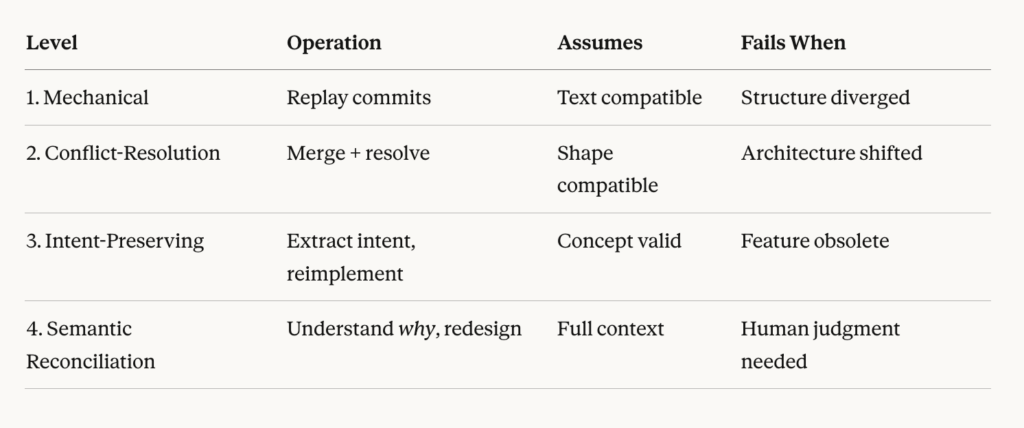
Level 1: Mechanical Merge (Simple Rebase)
This is what git rebase actually does. Replay commits onto a new base. It works beautifully when your changes are textually compatible with the new baseline—when the files you touched haven’t fundamentally changed.
git checkout feature-branch

git rebase master
Assumes: Your changes are additive. The code you modified still exists in roughly the same shape.
Fails when: Someone restructured the module you were working in. Your commits literally can’t apply.
Level 2: Conflict-Resolution Rebase
This is what most developers do when Level 1 fails. You merge, you resolve conflicts, you move on. IDEs are helpful here. You’re still operating at the textual level, but with human judgment applied to conflicts.
Assumes: The shape of the code is still compatible. The architecture hasn’t fundamentally shifted.
Fails when: Your branch assumes a certain directory structure, API pattern, or architectural approach that no longer exists in master. You’re not just resolving conflicts—you’re trying to fit a square peg into a round hole.
Level 3: Intent-Preserving Reverse Merge
Here’s where things get interesting. At this level, you stop trying to mechanically merge code and instead ask: what was this branch trying to accomplish?
You extract the intent of the feature, then reimplement that intent on the new architecture. Personally, I sometimes do this manually by merging master into the feature branch before trying to do a PR. It can be a bit impolite doing this type of “reverse merge” onto a human’s code as you’re effectively taking over their code, whereas an agent doesn’t mind.
This is fundamentally different from Levels 1 and 2 because you’re doing:
code₁ → intent → code₂
Rather than:
code₁ → code₂
The original code becomes reference material rather than source material. You’re not replaying commits—you’re rescuing functionality.
Assumes: The feature concept still makes sense in the new architecture.
Fails when: The architectural changes have made your feature obsolete, or the approach fundamentally incompatible at a conceptual level.
Level 4: Semantic Rebase (Reconciliation based on Meaning)
This is the hardest case, and the one Steve flags directly: “What should we do if Worker A deleted an entire subsystem, and Worker B comes along with a bunch of changes to that (now-deleted) subsystem?”
At Level 4, you need to understand not just what changed, but why. Maybe Agent A deleted that subsystem because it was replaced with something better. Maybe Agent B’s changes should now target the replacement. Or maybe Agent B’s work is simply obsolete and the problem it solved no longer exists.
This requires genuine understanding of both the old and new systems. It’s the level where human judgment (or very good AI judgment with full context) becomes essential. A semantic rebase doesn’t merge the code, it merges the meaning.
Why This Matters Now
For most of software development history, mechanical merges and rebases were sufficient. Teams worked on separate features. Branches lived for days, not weeks. And if they did become a dreaded “Long Lived Feature Branch”, you could periodically merge master into the feature branch to keep the home fires burning. The codebase didn’t shift that dramatically between branch creation and merge.
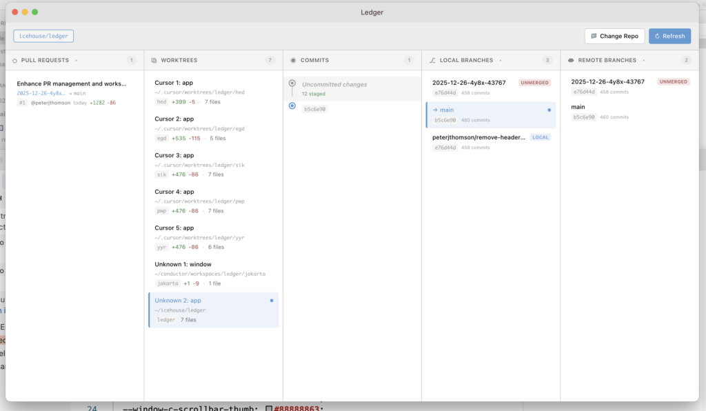
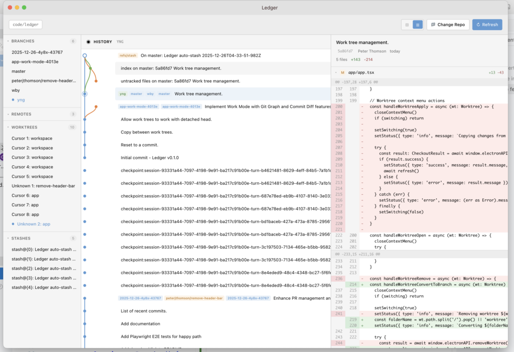
AI agent swarms change this equation entirely. When you have three, five, or ten agents working in parallel, each capable of making sweeping changes, the probability of deep structural conflicts goes up exponentially. This summer, I’ve been building an open source experiment in advanced source control tooling partly because I needed visibility into this exact problem: what are all my agent worktrees doing, and how badly are they about to collide?
The traditional git model assumes one canonical history that everyone’s rebasing onto. The swarm model creates multiple divergent histories that all need to converge. That’s a fundamentally different problem.
The human-in-the-loop
Yegge predicts the rise of the “superengineer”, someone who can orchestrate 100 coding agents and get meaningful work done with them. I think he’s right, and I think things like rescuing or reconciling divergence among agents (through things like a Semantic Rebase) will be one of the core skills that separates effective agent orchestrators from everyone else.It’s not about being better at resolving git conflicts. It’s about recognising when mechanical rebase is futile and switching to intent-preservation mode.
Something I’ve found helpful for codifying the semantic intention behind the code is “domain tests” and putting our documentation inside the repository so there’s a shared understanding between users, developers and agents.
Extracting intent from code (reading comprehension at scale exactly the skill Yegge says is “draining and beyond the capabilities of most devs”). Reimplementing efficiently on the new baseline, leveraging the new patterns rather than fighting them. Then making judgment calls about what to rescue and what to abandon.
This is, ironically, a task that the latest generation of AI agents are well-suited for: understanding intent and reimplementing, which suggests the solution to the “merge queue” problem might be… more agents. But specialised prompts, skills or sub-agents with reconciliation focus that understand both branches and can perform a “semantic rebase” themselves.
Tooling Gaps
Current git tooling is entirely built for simple code reviews and mechanical merging. git rebase, git merge, even fancy visual merge tools, they’re all operating at the surface textual level. What we need for semantic rebasing to work:
1. Branch intent extraction: What was this branch trying to do? (Commit messages help, but agents don’t always write great ones)
2. Architectural diff visualization: Not just “these files changed” but “the module structure shifted from X to Y”
3. Conflict severity assessment: Is this a Level 1 conflict or a Level 3 conflict? Should I even try mechanical rebase?
4. Intent preservation tracking: When I reimplement a feature, how do I verify I preserved the original behavior?
I’ve been experimenting with some of this in an open source experiment in visual source control, at minimum, being able to see which agent worktrees have diverged and by how much helps you prioritise what to merge first. But the deeper tooling for semantic rebase or “merging meaning” is still nascent across the industry.
Borrow this Prompt
Until better tooling exists, here’s a prompt I’ve been using when I need to perform a semantic rebase. It works well with Claude Code, OpenAI Codex, or similar capable agents that have access to your codebase:
Reconcile this feature branch with master so it can be merged cleanly. Do not change master, only this feature branch. Warning, master has undergone significant structural changes, so this isn't a simple merge from master to reduce the diff. Suggested approach:

1. First, assess the scope — compare this branch against master to understand what's diverged in both.

2. Merge master into this branch.

3. Resolve conflicts, prioritizing master's architecture where there are structural disagreements.

4. Rebuild/rescue feature functionality to work within master's current patterns.

5. Verify the feature still works as intended.

The goal is a PR that:

- Has no merge conflicts with master.

- Follows master's current architectural patterns.

- Preserves the feature's intended functionality.

Note: If the divergence is too severe, it may be faster to cherry-pick the feature's intent onto a fresh branch from master rather than wrestling with conflicts.
The key insight in this prompt is step 4: rebuild/rescue. You’re explicitly giving the agent permission to abandon the original code in favor of reimplementing the intent. And the escape hatch at the end acknowledges that sometimes even Level 3 rebase isn’t worth it, sometimes you need to start fresh with just the intent.
The Uncomfortable Truth
Steve is skeptical that we’ll get guardrails that make this accessible to “average” developers. I share that skepticism. Semantic rebase requires the exact skill that’s hardest and most draining: reading and understanding large amounts of code, in multiple versions, and making judgment calls about what matters.
The developers who get good at this, who can look at a hopelessly diverged branch and quickly extract its intent, assess the new baseline, and reimplement efficiently, are going to have an enormous advantage. It’s not just about prompting. It’s about understanding codebases at a level where you can direct agents effectively.
The swarm is coming. The merge queue is real. And “rebase” is about to mean something much more interesting than git rebase.
I’m making a desktop app for managing Git repositories with AI agent worktrees open source and available for free on Mac, Windows and Linux. If you’re running multiple coding agents and want visibility into what they’re all doing, check it out.
New software is often tested through a variety of methods such as unit testing, feature testing and integration testing. Recently we’ve been making some major upgrades to the Icehouse Ventures investor portal and we’ve wanted to be sure that the changes to the software don’t change the business logic. I think the style of testing we’re doing might be useful for other teams to explore. We’re calling this new style of testing “Domain Testing”.
Domain testing focuses on validating the correctness of our application’s business rules and domain-specific logic. Rather than testing technical implementation details, “domain tests” verify that the system produces the correct outcomes in realistic business scenarios.
In our venture capital context, this means ensuring that complex financial workflows such as fund management rules or carry waterfall calculations behave as intended. For example, one of our domain tests verifies that when a startup company generates a return, the correct amounts are shared across investors.
All software teams have been doing some kind of “scenario testing” forever in various forms, but we haven’t always had a consistent name for it. Domain testing focuses in on testing a specific business function. The goal is to prove that real-world business rules hold true, using concrete examples that reflect how the software is actually used.
Domain Testing vs Existing Types of Tests
Unit Tests validate individual methods or classes in isolation. Checking that a specific function returns the expected number given certain inputs.
Feature Tests cover entire user-stories, or features potentially including the user interface, controllers and the database, often crossing multiple domains or services.
Integration Tests verify that different parts of the system interact correctly. In Laravel, this might mean simulating an HTTP request and asserting that the controller, ORM, and database all work together.
Domain Tests validate specific business scenarios. They don’t necessarily go through the UI or HTTP layer. Instead, they check domain logic directly in the code. The key difference is that domain tests explicitly encode business intent.
For example, consider this finance module scenario:
Givena fund of $10 million with an 8% preferred return hurdle, When the fund earns $2 million of returns in its first year, Then the investors (LPs) should receive their preferred return before any carry is distributed to the fund manager.
This reads like a real scenario. It verifies that the carry distribution follows the defined waterfall (a critical business rule) without getting off track into implementation details.
Test Driven Development for AI
The long established practice of “Test Driven Development” could take on new importance in the era of AI-assisted development. Modern LLMs like Claude and ChatGPT are quickly evolving from simple code auto-completion tools into reasoning agents that can create or update whole new features. But as the scope of AI development widens, the consequences of errors is becoming more serious.
A solid test suite serves as both a safety net and interestingly as a guide when an AI helps generate code. LLMs are powerful but prone to hallucinations or subtle logic errors.
By writing tests upfront (especially Domain Tests that define expected outcomes) we create guardrails that keep the AI on track. The developer specifies the correct business behaviour in the tests, and the AI must work within those constraints. This turns TDD into a way of “teaching” the AI what we actually want.
Domain Tests as Executable Documentation
Domain tests create a shared language of expectations that both humans and machines can understand. Written in terms of business scenarios using clear language and examples, they serve as executable documentation of what the software should do.
Developers, product managers, and even non-technical stakeholders can read these scenario-based tests and understand the system’s intended behaviour. The test suite becomes a living specification of the domain.
This clarity extends to AI systems too. An LLM assisting you can read your domain tests and see the business rules and constraints of your application. If it proposes a refactor or new feature, you can re-run the domain tests to verify the AI didn’t break any fundamental business rules. Our domain tests encode the business rules in a form that a machine can work with.
Domain-Driven Design
DDD teaches us to model software around the core business domain. In domain testing, we leverage these same concepts. One of the concepts we borrowed from DDD for our domain tests was “inspectability”. Meaning that you should be able to put the system in the ‘test’ state and let a human look at it.
Normal software tests are usually randomised and empheral, not designed for human inspection. Using a specific, repeatable scenarios is like the Kobayashi Maru simulator test in Star Trek, the setup is consistent so you can explore different solutions that achieve the end goal.
Practical tip: We use Laravel’s “factories” and “seeders” to set up our domain scenarios. This way we can quickly spin up a fake Fund with ten fake investors, each with certain ownership percentage, then create transactions to simulate cash flows. When your test reads like a story, you know you’re staying true to the domain-driven spirit.
Behaviour-Driven Development
BDD’s Given/When/Then syntax models test scenarios in a way both developers and business stakeholders understand:
Given: a scenario setup
When: something happens in our system
Then: the result is a predictable output.
This structured narrative helps communicate intent. A finance expert could glance at this test and confirm, “Yes, that’s exactly how the waterfall works.”
You can implement this style in Laravel with PHPUnit or Pest. The key is writing tests that tell a story: set up context (Given), perform an action (When), and describe the expected outcome (Then). For normal tests we use Arrange, Act, Assert which is also fine but slightly less suited to domain tests.
A Practical Way to Calibrate AI and Humans
Looking forward, I think domain tests may become a crucial calibration tool between business intent and AI execution. Think of them as the training examples you provide to a junior developer, except the dev will be an AI.
If an AI proposes a database schema change or generates a new Laravel controller, how do we ensure it didn’t break fundamental business assumptions? Run the domain tests. A comprehensive suite will immediately flag any business rule violations, giving both human and AI rapid feedback.
Domain tests also become a sandbox for business validation. Write a test that sets up a complex fund with edge cases (different fee structures, multiple closing dates), run the domain logic, and use Laravel’s debugging tools to inspect the output. It’s like a flight simulator for our business logic, we can try scenarios out in a safe environment.
Implementation in Laravel
Laravel makes it easy to implement domain testing:
Use model factories to create realistic test data that feels real.
Create dedicated test seeders that load the complete scenario in a repeatable way.
Leverage database transactions or RefreshDatabase traits for test isolation.
Structure tests around your domain services, actions and jobs, not just http endpoints.
Your tests become a place where everyone can see the essence of the application laid out in scenarios, where changes can be vetted with confidence, and where future tools can learn what “correct” means in your context.
Conclusion
Domain testing is a practical way to:
Validate business-critical behaviour with high confidence, if a change breaks fund carry distribution maths, a domain test will catch it.
Communicate intent across disciplines through tests written in business language, serving as living documentation.
Build on the best of TDD, BDD, and DDD without reinventing the wheel.
Prepare for AI-assisted development by creating tests that define boundaries of correct behaviour and logic.
As we rediscover testing principles in the age of AI, domain testing could be a language of shared understanding between humans, software, and intelligent agents. It ensures that no matter how our code is written (by us or by AI) the true intent and logic of our business domain remains solid.
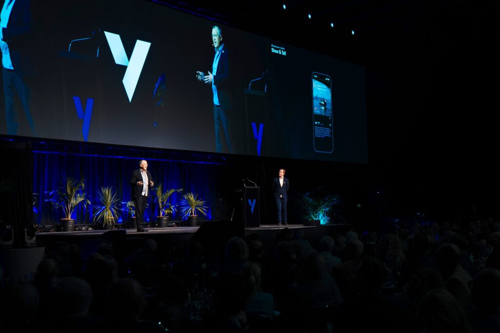
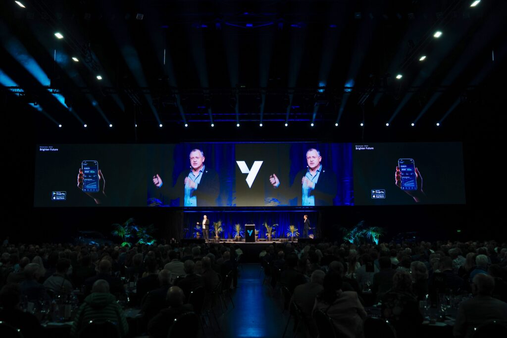
Script from the launch of the Icehouse Ventures mobile application at the Annual New Zealand Startup Showcase at Spark Arena on 21 August 2025. We had some tech issues on the night, but it was great to share what we’ve been working on with so many people, and so far the reaction from users has been great.
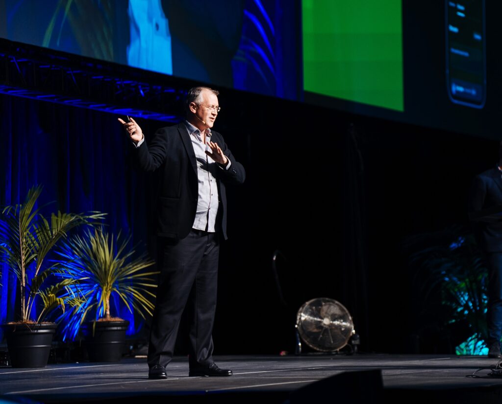
Good evening everyone. My name is Peter Thomson, and I’m the CTO at Icehouse Ventures. I have what I think might be one of the best jobs the country because I get to spend my time with all of these great startups we’ve heard from tonight and all of you as investors. It’s like Showcase all year round.
I’m particularly grateful to our early adopters many of whom are here tonight like Maurice Maclaren, Richard Reynolds and Ian Holland. Who’ve given us such great feedback over the years.
At Icehouse Ventures, our greatest strength has always been our community of investors, founders and operators. The great startups coming out of New Zealand can become even more unstoppable with a large & engaged network backing them.
But to be engaged, you first need to be informed. And that’s what we’ve been working on for the last five years with our custom-built Investor Portal. When we started on this journey, there wasn’t any software available that could connect a large network of investors with a diversified portfolio of startups, to deliver an immersive experience, while maintaining institutional-grade reporting and security. It didn’t exist, so we had to build it.
But now it’s time to take things up a notch. We want to supercharge your ability to support these great companies. And to do that, we’re going mobile.
Tonight, we’re proud to introduce the Icehouse Ventures Mobile App (available now on iOS and Android). This new app is your window into the people, ideas, and companies building the future of New Zealand. We’re putting the brightest New Zealand companies in your pocket. With a host of new features, you can be engaged with these great companies, not just at Showcase, but all year round. Let me walk through just a couple of the features before I hand back to Robbie.
First, Discussions and Co-Investment. Imagine getting to tap into the experiences & connections of 3,000 fellow investors. With this app, you can now read Investment Memos on the go, ask questions of the founders and participate in due-diligence discussions. It’s the professional investing experience that we’ve always delivered, made portable.
Second, Notifications. These days, startup investing can move fast. Whether it’s a new round opening up, or a capital call. You don’t want to miss out. And recently, Halter’s follow-on round was over-subscribed within a matter of days. The app will help keep you in the loop.
And third, Show & Tell. If you’re in this room, you already know that there are great companies, doing great things here in New Zealand. But not everyone sees what you see. We want to give you a window into their world, one that you can share with your family, your friends, and your colleagues. We want to bring you short, sharp videos direct from the startups so you can stay up-to-date and share their stories.
What I love most about this asset class is how it can inspire the next generation, Our seven year old, Isabelle has recently started getting interested in tech companies and it’s not because of the TVPI or the IRR, it’s because she and I started watching videos together about what the companies are up to. She saw when OpenStar first sparked plasma in Wellington. And she came along for the ride along as Dawn Aerospace took off for space. This isn’t doom scrolling, it’s a front-row seat to history.
Our growing tech platform is built to give New Zealand an unfair advantage. And pursue our mission of making investing in Kiwi startups: transparent, engaging and rewarding. The mobile app was built in-house by our Principal Engineer, Ian Patel and it runs on same core system that powers our main Investor Portal. So we all benefit from the years of hard work by Harry Fakir, Logan Gubb, Nikita Deva, and the rest of the Icehouse Ventures team.
So tonight, we invite you to download what we believe could be a world-first: The chance to have an entire VC firm in your pocket. Please, use the app to amplify the stories of these great companies within your own networks, because the startups are already doing great things, and with your backing, they can be truly unstoppable.
You can watch a clip from the live stream of the presentation on stage here (5 mins):
As technology becomes central to modern business functions, professionals in marketing, finance, and operations increasingly want to tackle projects traditionally reserved for software developers. Having transitioned from corporate law to marketing and then to software development, I’ve gathered tips to make the journey into vibe coding easier and more enjoyable.
Modern AI tools significantly lower the barrier to entry for coding, but there is still a learning curve to being productive in a business setting. My goal here isn’t to turn you into a full-time software engineer, instead the goal is for you to use AI to better understand and work with complex business systems. You can use modern AI coding tools to explore, tweak and build business workflows in hours that would have traditionally taken weeks to implement.
Why Laravel?
Beginners and non developers are often steered by AI toward JavaScript frameworks like Next and React, or Python for data science. I think this is a mistake because:
PHP has 20 years of open-source history, giving LLM models rich context for solving any business problem you encounter. The training examples and content for Laravel apps are often practical B2B SaaS in complex industries like finance, healthcare and manufacturing. Laravel is used by Apple, NASA, Ferrari, DHL, Square Payments, The New York Times, Marvel and OpenAI along with thousands of SaaS startups and in-house custom business applications.
Laravel is a powerful framework that includes robust authentication and database setup out of the box—features that beginners often struggle to implement securely.
PHP excels at rapid prototyping. Plus, if your business has an in-house SaaS platform, there’s a good chance it’s built in Laravel. It makes more sense to learn Laravel from the start rather than coding everything in React only to switch languages later.
The fundamental model of Laravel with MVC, database and logic layer makes it the preferred choice for a lot of SaaS startups, in-house tech teams and digital agencies building rapid prototype software for clients.
Personally, I’ve fallen in love with Laravel because of the helpful community and the focus on clean, minimalist code. The framework is magical for taking complex business domains like investment, finance, education, health or other industries and building software that solves real business problems fast. With AI tools improving rapidly, real code is rapidly replacing low-code tools as the best way to spin up software to streamline business processes.
Every day I’m thankful that we made the call to build the Icehouse Ventures in-house investor portal in Laravel because we have complete flexibility to add features and customisations that suit our exact business model (a large and diverse network of investors making long-term investments into a widely diversified portfolio of tech startups). Using Laravel for the last five years has helped us scale to become the largest and most active Venture Capital firm in New Zealand. Having custom software has allowed us to build investor and founder support functionality, data analysis, and advanced automations that no other VC firm has access to.
Laravel has robust tooling for solving business problems such as custom CRM systems, automating workflows, modelling complex business processes, and integrating with third party APIs data sources. Imagine Excel, HubSpot, Salesforce, Zapier and Notion all in one place and with complete freedom to wire things together in ways that suit your exact business.
Setting up your machine
To start using Laravel you’ll need to set up your machine. Hardcore engineers spend most of their time on the command line for tooling and setup. One of the things that helped me transition into development and suits my big-picture desire for an overview of what’s going on in a system is to use a lot of GUI or visual tools. I find that visual tools make it much easier to understand how a Laravel application works and how to make changes. There are a few key tools that will help you get started:
Version Control: SourceTree
Version control is like a giant upgraded version of a word processor’s ‘track changes’ feature. Full time software developers use version control systems to make sure that they can’t lose their work and that multiple people can work on a project at the same time. It’s useful to have a version control tool on your machine so that you can see the other branches of code and it provides a simple place to make forks of code and to review your changes.
Github is where your company’s code base is most likely contained. SourceTree is a great git client that provides a visual interface for managing your codebase. It makes it easy to commit, push, and pull changes, as well as resolve merge conflicts. Version control is essential when working with AI code tools because it lets you experiment without breaking the main codebase.
Database: TablePlus
A relational database is like a giant spreadsheet with lots of tabs and links between the rows. The database is a key part of a modern web application so you’ll need a way to access your local copy of the database and to see what’s going on. Sequel Pro and TablePlus are both excellent visual tools for accessing a local database so you can see the changes that your application is making. You’ll set up your application’s database later in the process, but having a database viewer set up early will help you debug things and access the database manually as soon as it’s loaded.
Text Editor: Cursor
An integrated development environment is like a word processor specially designed for software development. I personally use Sublime as my text editor for its speed, calm interface, and minimalist design. However, for business professionals accessing their company’s codebase, I recommend Cursor. It combines VSCode’s benefits (plugins and customizability) with powerful integrated AI support.
Cursor’s AI support has several evolving layers, and it’s worth understanding how each can help you engage with a codebase:
Tab / Autocomplete Mode – Works well with existing Laravel code to add small features and tweak the wording on web pages.
Chat / Ask Mode – Great for exploring the code without making unnecessary changes.
Agent / Edit Mode – Modern LLMs can make significant progress on building new functionality in a Laravel app. But they need careful guidance and clear instructions.
Bug Fix / Pull Request Mode – This allows you to review changes and do quality control.
Cursor Plugins
There are a few things you can do to set up Cursor to work really well for Laravel development:
Laravel – The official VS Code plugin helps Cursor to understand Laravel code.
PHP Intellephense – This is what allows you to click through different functions and see the context for the code.
Back & Forth – This adds a ‘back button’ to the top of the editor window which is awesome for navigating around the code base.
Duplicate File – A better copy/paste that makes the sidebar faster for duplicating files (which you’ll be doing a lot of if you’re starting out).
Cursor AI Setup
There are several things you can do to get the most out of modern AI support:
Add a Cursor rules file to your project if there isn’t already one. This should contain some context on the application and a style guide.
Add links to the Laravel documentation to your Cursor “docs” setup. I use the secret Laravel Illuminate API docs which are a machine readable version of the human Laravel documentation.
Like with other advanced business projects it’s worth chatting with an LLM before starting work to make a plan and an outline. You can add these to Cursor by adding a file such as “project_plan.mdc” (markdown format) to the home folder of your project. Then add that to the context when asking the AI for help with specific tasks.
Virtual Machine: Herd
Laravel has several methods for getting a local copy of a code base running on your machine. Docker and Valet are both excellent options but there days Laravel Herd is the fastest way to get up and running. The virtual machine is what allows the application code that usually powers a website to run locally on your own machine without the internet. You can access the website using a normal web browser but instead of calling the internet, it just calls your local machine.
Scratchpad: Tinkerwell
One of the tools I wish I’d had earlier in my journey was a way to run tiny blocks of code without having to change the whole application. Tinkerwell is a tool that lets you write standalone php code and run it with the context of your Laravel application. It’s rocket-fuel for experimenting with random ideas. For example, I recently used Tinkerwell to loop through our portfolio and analyse the gender balance of founders without needing to write permanent code or do a pivot table in excel.
Getting Started: Laravel Starter Kits
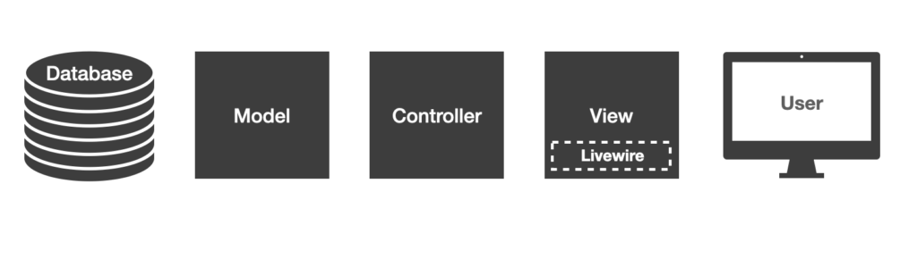
The Laravel Documentation has good examples of how to create your first Laravel application. Personally I’d suggest choosing a simple first-party Laravel Livewire starter kit with Tailwind. There are lots of third party starter kits with React, Vue and other front-ends but Livewire keeps things simple. The official Laravel documentation has a great step-by-step guide to seeing up your first Laravel application.
Laravel Cloud provides a fast and easy place to deploy your first application if you need to share it with other people for testing. There are also lots of great resources on how to deploy a Laravel application to AWS and other web hosting platforms.
Key Concepts
There are a few key concepts that really help when experimenting with a code base and when discussing project with your development team.
Model View Controller
The Model-View-Controller (MVC) architectural pattern is a fundamental concept in Laravel. It separates the application logic into three interconnected components: the Model handles data management, the View manages the user interface, and the Controller acts as the intermediary, processing user input and coordinating the flow of data between the Model and View. Think of MVC like a restaurant: the kitchen (Model) prepares the food (from ingredients like the database and any APIs), the waiter (Controller) takes orders and delivers food, and the front of house dining area (View) presents the meal.
Relational Databases
Relational databases are the backbone of most Laravel applications, providing a structured way to store and retrieve data. Familiarizing yourself with concepts like tables, columns, rows, and relationships will help you understand how to model your application’s data and leverage Laravel’s powerful Eloquent ORM (Object-Relational Mapping) to interact with the database. This knowledge will empower you to create robust data-driven applications that can scale and adapt to your business needs.
Database Seeding
If you are starting out with a new application to experiment or your business is in an industry where sharing production data is prevented for privacy reasons then it may be better for you to use synthetic data. Most teams will have a masked-data dump or a test database available but it’s worth understanding the concept of Seeders in Laravel as they allow you to create your own test data. Seeders are a command that creates multiple fake but realistic rows in the database and links them together. Using fake data makes it much safer to test new ideas.
Test Driven Development
Laravel has automated testing out of the box. If you are building a new feature or a proof of concept then adding automated tests is a great way to guide the AI and to prove to the rest of your team that you’ve thought through what you’re trying to achieve. I use a lot of “smoke tests” which means if you try the thing using the happy path (all data in place and doing the main thing the page does), does it work or does it smoke / catch fire when you turn it on. LLMs are great at generating tests and knowing that the tests pass is a good way to check the AI’s work.
Proof of Concept
The concept of minimum viable product comes from venture capital and is a great thing to work towards. But if you’re vibe coding it’s more sensible to aim for a simple “proof of concept” which is code that isn’t intended to be ‘viable’ as in secure, performance optimised and robust enough for production. Instead, a proof of concept is intended to demonstrate the functionality you want in a proposed feature and to help visually communicate across teams. Traditionally this would have been done with paper sketches, prototype or design tools. But with rapid AI advances it’s often useful for business users to have a go at exploring the proof of concept themselves.
Being a team player
If you are working in an existing code base there are some unspoken rules that can help you be a good citizen. AI can allow you to understand, modify and add to a Laravel application very quickly. But it’s worth playing nicely with your existing development team (if you have one, or might hire one in the future).
Make the smallest changes possible (don’t let the AI run wild and re-write the entire code base as it makes things hard to review). Stay focused on one proposed feature or idea. (Doing too many things in one branch can confuse the AI and the humans you have to collaborate with).
Ultimately, product teams do much better with “user needs” as a brief than a proposed solution because often the best solution is deeper in the architecture of a problem or root cause. So don’t just make a proof of concept and say “here just implement this”, instead use the POC as a starting point for a conversation about what you are trying to achieve and why it’s important to the business.
Problem Solving
For a non technical professional exploring code one of the key things I learned was to slow down and read the documentation and any error messages. They may look confusing, but Laravel’s error messages are carefully crafted to guide you but it takes real effort to slow down, read them methodically. The error messages are also gold for pasting back into the AI to help debug.
The journey
I got started on the journey from lawyer, to marketer, to software developer (and now Chief Technology Officer of the product team at a Venture Capital firm) by simply making small changes to an existing code base. There is certainly a scenario where AI replaces the need for software developers entirely, so learning to code is a waste of time. But I think it’s more likely that AI allows non-technical subject-matter-experts (that’s you) to meaningfully engage with code in new and exciting ways that opens up the profession to thousands of people from diverse backgrounds and mindsets who can bring new best practises and new solutions. There’s never been a better time to start coding.
So I wanted to give a quick update on the insolvency situation with the skifields on Mount Ruapehu. You might have noticed today in the press that the valuation seems to be settling in for what the life pass holders’ votes would be worth at the watershed meeting in terms of voting on the outcome of the insolvency process.
Community Ownership
I’ve had a few people ask me, “Okay, well look, how did we get into this situation in the first place and what do we want to have happen going forwards? Because it’s just all too complicated, too much corporate stuff.”
The first thing to remember in terms of fundamental principles is the skifields have run as a community owned non-profit for 70 years. Thousands of skiers over the years have bought debentures, bought shares in the company, bought life passes, season passes, etc. All sorts of people have been involved over time and fundamentally, this is a skifield that was created by the skiers for the skiers.
And therefore, in a lot of ways, the skiers are the natural owners of the skifields on Mount Ruapehu because we are the ones who will support the skifields in good times and in bad. And owning a ski field in a national park on a mountain that is sacred to the local Iwi, it can’t be about exclusive possession, and profit, and extracting value. It’s about a responsibility to cherish and respect and stay humble in the face of the mountain.
People keep saying to me that, “Oh, we don’t want to end up here again” and you know, the fastest way to end up here again is to give the ski fields to a hundred percent for-profit corporate investor and then wait for a couple of years for a snow bad snow year, or some trouble getting local staff or an eruption. And then the business-case for top-up investment won’t stack up in, we’re gonna be right back here with the company out of money quicker than a rich banker can say. “I’m sorry, the business case doesn’t stack up to throw good money after bad, and we’re pulling the plug.” And that’s something that it was just too terrifying to imagine in terms of the consequences for the local economy, the local community, and the skifields.
So if you want to avoid being back here, then we need to let the people who love the mountain have the chance to become the long-term owners of the assets. And a little bit like parents of teenagers, we might not love it if the skifields happen to run out of money again. And they call up asking for money in the future, but then we are always gonna be there. We will do whatever it takes to keep these skifields operating because we love being up in the mountains and we value it. And, and that’s, something that’s fundamentally priceless. And it’s not gonna appear on the balance sheet for some corporate investor.
It’s not a non-profit because we hate making money, it’s because it’s a tough mountain and frankly, you need to be ploughing every cent that is generated in terms of returns back into maintenance and improving the assets. It’s an expensive sport, and the non-profit element does help keep the lift prices modest and and inclusive in terms of people being able to come out and try out the sport. It means that when you come to negotiate with DOC or with Iwi about the concession renewals, there’s not just some rich overseas company exploiting our natural resources for their own gain. It’s a locals mountain, and these days, by locals, I mean the entire central North island.
Insolvency background
So, where did things go wrong? I think when things went wrong with the skifields, was when they tried to get more corporate and started borrowing money, covid and some of the recent bad snow years were really just the last straw. They’re not necessarily what caused the situation that we’re in at the moment. The Sky Waka is a national treasure and it was funded by a pretty good mix of bonds from Iwi, strategic investors, government loans, etc. Lots of people came together to get that project going but there should probably have been shares or multi-year passes or life passes or something sold so that it wasn’t just all debt. Because we know, particularly now, that no business can survive only on borrowed money.
The former board of directors had somehow formed this view that you either couldn’t sell shares because there was no dividend, or that if you did sell shares that would somehow be illegal, or that even if you could legally sell shares, that no one would want them. And we’ve now tested that out pretty thoroughly, and that’s not quite right. We’ve gotten independent legal advice on issuing shares. We’ve even went as far as writing to the FMA and, obviously they can’t provide legal advice, but we’ve found plenty of examples of co-operative businesses raising capital, and we’ve found lots of examples of companies that don’t pay a dividend – but rely on a capital gain or capital appreciation, and they’re perfectly able to raise capital. So this business is able to be invested in. It might need some modifications to do so, but it is an investible proposition and we’ve done research that has shown that there are tens of millions of dollars out there in people that want to invest in supporting the skifields.
There are thousands of people who have come out saying that if we could get this thing onto Snowball Effect or the Unlisted Market, some sort of ability for people to buy shares, that they want to be co-owners of the skifields. That’s something that’s exciting to people. And if there was a return that happened to go along with it, then more the better, but that’s not the fundamental thing driving them. And that’s okay.
We’ve run some financial models going back the last 15 years just to test how the share price would have fluctuated if you priced it based on “net asset value”. And so it ranges between about $800 per share when the company’s having a bad time, and then it went up to about $1,700 per share and the average is about $1,000 a share. Now, that’s no indication of what the share price would be going forward, but what it did prove is that it is possible to run a model that shows what a fair price would be for the business in terms of either buying shares, selling shares, operating a market, all of those sorts of things. It’s not, it’s not to say it’s easy, but it’s certainly possible.
Voluntary Administration Process
So it is good that the government have stepped in and supported the skifields over the last year or so. It’s been amazing to have that support, but seeing them then turn around and use those loans to step in, override the legal Voluntary Administration process and basically run a “shadow liquidation” and sell off the assets and privatise them. Just doesn’t seem fair-play. The government are major creditors and they’ve put significant money into the business and as the crown, they could have been uniquely positioned to try and bring all of the parties together and find a collaborative solution that created long-term stability for the skifields that we’re all looking for. But somehow it seems like the government have appointed the specialist insolvency practice, and they’ve been conducting basically a shadow liquidation and they’re selling off the assets to the highest bidder. This process needs to have been run with the highest levels of integrity because it’s such an important asset to the community.
One thing I can point to is that PwC have published on their website, the official minutes of the creditors committee meetings, they’re worth reading because one of the things that they show is that the government have not attended any of those meetings. And I mean, where have they been? They’re every week and they’re talking about the skifields and the government just haven’t been there. And, that’s telling. I think what’s happening, if you read the minutes of those meetings, that you can tell of layered in between the conversations, that the government have taken control of the process. So they’ve been the ones that wanted to sign off on the season passes, which still haven’t gone on sale, – the snow’s falling and we still don’t have season passes available for sale. And they’ve been wanting to be the ones reviewing potential bidders and organising the pre-pack process in terms of how the insolvency plays out.
It’s amazing that the government stepped up. But they only, invited us as a ski community to get involved at the last minute. So we ended up spending our Easter Weekends writing up a bid, and we did that because no one else had officially put up their hands and said that they working a bid. There were some rumours about who might put in a proposal, but they’d been pretty secretive about that. And, I respect that because they had NDAs, but it did mean that we were left with a situation where the fact was that no one had put up their hands. And so someone had to, and so we as a community did put up our hands to be involved. And the government put a bunch of terms on that bid. Conditions that I can definitely not talk about because they’re subject to very specific non-disclosure agreements. But they had pre-existing views on everything from life pass holders, whether or not they had to pay, treatment of secured creditors, trade creditors, even the process and mechanism for implementing of the transaction. And again, I cannot talk about that, but what I can say is, it’s not a pretty picture.
I think what’s gotten the local community, Iwi, and the Mountain Clubs riled up is that the government then seemed to have gone out and chosen their winners without consulting anyone. And probably, not giving us a fair go. There’s been no transparency on what the criteria are for those selected bidders. And even then, it’s not the government’s mountain to just unilaterally sell to the highest bidder. That doesn’t seem fair. There have been two community bids and it looks like the corporate types aren’t giving them a run or following due process. But, that’s a story for another day.
National Park Concession
I will let you in on a secret in terms of why I think community ownership is so important to the ski fields. So the National Park operating concession renewals come around every 30 years. And so the ones that are in play now will eventually be renewed. And when they are, DOC are going to have to go out to the local Iwi and the local community to get consultation on that process. And by then it might be person-hood for the mountain, or co-governance, all sorts of things could have shifted.
I’ll tell you one thing. It’ll be the kids now in Raetihi, Taumarunui, and Tokaanu going to school in their childhood right now. They will grow up with however we set up the ski fields now. They will grow up with that being their experience of skiing on the mountain. So if the ski fields are community-owned, welcoming, lots of local employment, really good social connections, really well connected to the local community, good terrain parks, good vibes. Then when the concession renewals come around in 30 years time, it’s gonna be a big, big tick. We love being up on the mountains. We love going skiing. Sounds good. Keep it up.
But if we fumble it right now and we sell off the ski fields to the highest bidder, it gets privatised, sold into corporate hands. They double the price of lift passes and turn. The whole thing into a playground for the ultra-rich with valet parking, champagne bars, sit down Alpine Restaurant Dining experiences. Then when the concession renewal comes around, the local community will buck. They’re gonna kick back and they may kick back hard and we could lose the right to ski on the mountain entirely. So fundamentally, this looks like it’s an argument about corporate business models, but actually it’s about being respectful guests on the mountain.
Capital Planning
So, where’s the money gonna come from? There are thousands of skiers who have pledged tens of millions of dollars. People love skiing on Mount Ruapehu and they’re willing to pay for ski passes in advance. Willing to invest big and small amounts, volunteering to help out. There’s a Give a Little, which has raised about $25,000 from about 800 people, last time I looked.
Peter Hillary has come on board as a founding patron of the community effort, he’s been absolutely amazing as a patron because he really believes in the importance of the ski fields in getting New Zealand as outdoors and introducing people to the natural alpine environment. He’s taking a much wider view of tourism in the central North Island. In the regional economy, thinking about employment in places like Raetihi, Taumaranui, Turangi, or Ohakune, these aren’t necessarily affluent communities, and there’s a real need for year round employment in the tourism industry.
There’s been an amazing groundswell of support. There’s about $10 to $15 million in investment required over the next five years, and it’s not all in year one, which is some of the stats that we’ve seen or the kind of scare tactics saying, “Oh god, you’d need $10 million on day one”, and it’s just not true. There is maintenance that needs to be done on those mountains, but it can happen in a staged manner over time, and that’s part of what we need in terms of a sensible plan going forward.
There’s about $13 million in expressed interest in terms of equity investment that would be combined with about $7 million in a settlement fee, which is life pass holders paying to retain the right to ski. – Probably at about $1,000 per pass, although that’s subject to some discussion. There’s good years and bad years, but there’s some operating cashflow, which helps support the business. There’s probably about $7 million in what we call one-off product purchases, so that’s things like five-year passes, platinum parking passes, new life passes, or life pass renewals. That’s actually a non-trivial amount of money that could come from the ski community in terms of additional product purchases. And then eventually, if you need it there, there’s probably about $10 million that you could make available in strategic long-term debt. You don’t want this business living hand to mouth and just borrowing money to survive, but with the right strategically aligned investors and bondholders, there is absolutely a model there in terms of making investments into new assets.
Fundamentally, the Ruapehu ski field situation is about a back to basics, locals and families. Who love the mountain and are basically up against the rich bankers and bureaucrats who want to turn the ski fields into a plaything for rich overseas tourists. It’s about privatisation versus community ownership.
I have a four year old and a two year old, and last year we took them to Happy Valley. And then went up the gondola for a fluffy and look, they’re going to remember that weekend for the rest of their lives. They still talk about how much fun it was being up on the mountain and the idea of losing that for an entire generation of New Zealanders, because not everyone can afford to fly to Queenstown for a weekend in the school holidays. That’s what’s been driving me.
Despite, frankly, all sorts of corporate politics, we’ve had death threats for some of the team, angry locals, online social media trolls, people threatening me and my family, people leaving bad reviews on my employer’s website, all sorts of crazy stuff. But it’s worth it because it’s the humility and the camaraderie of being up in the mountains that’s kept the ski fields in community ownership for two generations. We can’t fumble the pass. Let’s not just flog off the assets to the highest bidder and leave our kids with just another corporate model. That doesn’t seem right.
It’s a tough mountain. And they say if you can ski at Ruapehu, you can ski anywhere. But anyone who spent time in the mountains knows that you have to look out for each other. This is a once in a generation opportunity to set up the ski fields for another hundred years and to hand it over to our children in a way that they can respect, love, and engage with the mountain that we all love.
Modern product design is a mix of user interface design, user experience, graphic design, design thinking, research and data visualisation. There are a few videos that have influenced my thinking over the years on what great design looks like the the way that we can create products and services that meet people’s needs in surprising and delightful ways.
Practical design processes
Steve is one of the co-creators of the Tailwind CSS framework and his talk at Laracon 2019 was intended for software developers but is actually a good view into how a modern interaction designed solves practical problems.
Design sprints
The Google Ventures design sprint methodology is a bit extreme (they try and fit everything into one week), but the Sprint approach is a great combination of Design Thinking methods with the Lean Startup mindset.
CSS for rapid prototyping
Adam Wathan is the main creator of Tailwind and his talk is developer focused, but it’s a good insight into the mindset behind how Tailwind can be used for rapid prototyping.
Human centred design principles
Dan Norman’s book The Design of Everyday Things was hugely influential on how I think about human centred design.
Data Visualisation
Data visualisation is vital to making finance and investing understandable to people. In 2007 Hans Rosling presented one of the best TED talks of all time when he used charts and data visualisation to help people understand global health policy.
Design Thinking
The original gangsters IDEO at the height of their awesomeness (they never quite adapted to digital design) but this video changed my life back in 1999 when the ideas of rapid prototyping, user observation and designing for latent needs were counter-cultural and revolutionary.
I spend most of my time at the coal face of new product development inside tech startups. But I’m occasionally called on to help with the broader application of technology throughout a medium-sized or larger organisation. I love seeing how improving their digital tools and systems can make an entire organisation more customer focussed.
Some digital projects only impact one part of the overall customer experience, but these days, any good software project should really consider the wider context of the entire organisation and the whole customer experience that they deliver.
Different company sizes approach digital transformation differently
I’ve noticed that digital transformation projects can be very different in a small to medium sized organisation. Corporates, startups and mid-sized SMEs handle digital transformation and customer experience innovation very differently:
In a corporate there are whole teams dedicated to technology and the connections between functional departments. While there is a lot of bureaucracy, digital transformation and customer experience projects are feasible inside a corporate because they can throw resources at a problem.
In a small business or startup, the whole team is closely enough connected that cross-functional collaboration is inevitable. While resource constrained, the ability to implement change quickly makes startups fast to adapt to changing circumstances and customer needs. They also often have the advantage of dedicated internal software developers, digital marketers and operations specialists with deep technical systems experience.
Good honest medium-sized SME businesses can be the teenagers of adopting digital technology. Big enough to have departments with competing goals and seperate tech systems. But small enough to be resourced starved and unable to invest in major organisational change projects. Digital transformation is hard for SMEs.
Icehouse Ventures is a small, independent rogue team that spun out separately from the Icehouse several years ago. I’m now the CTO of that business and we effectively operate as a tech startup ourselves with dedicated marketing, operations and software development capability. But it wasn’t always like that. And the wider Icehouse (in particular the SME learning & development business) has been through a genuine company-wide digital transformation over the last two to five years. There are several lessons that we’ve learned at the Icehouse in pursuing our own digital transformation and in helping other medium-sized New Zealand businesses with adopting digital technologies better across their whole business.
Digital technology maturity scale
Digital transformation is simply a description of the broad adoption of digital technologies throughout a business. Digital transformation is best measured by how connected together a customer’s experience is with the business. There are several levels of maturity in a company’s gradual digital transformation:
Disconnected Experiences: At level one, every business system is separate and siloed (or possibly offline entirely). For example, it’s annoying for customers when a store’s e-commerce website can’t show whether a particular branch has stock on a particular product because the stock management system doesn’t talk to the website CMS. Or when you lose your receipt for a warranty claim and the loyalty card system won’t talk to the warranty claim software.
Connected Experiences: At level two, a company’s various internal systems are separate but are starting to be connected by syncing tools and APIs. This starts to allow for more connected experiences. For example, an e-commerce order can be re-routed easily to in-store click & collect. Or a forgotten loyalty card can be easily looked up using a phone number.
Seamless Experiences: At level three, a company’s systems are so well integrated that they can be navigated by the customer just as easily as internal staff. At this level we see self-service customer portals, hybrid in-store and on-line checkouts, and in-store payments collected by a self-service mobile app.
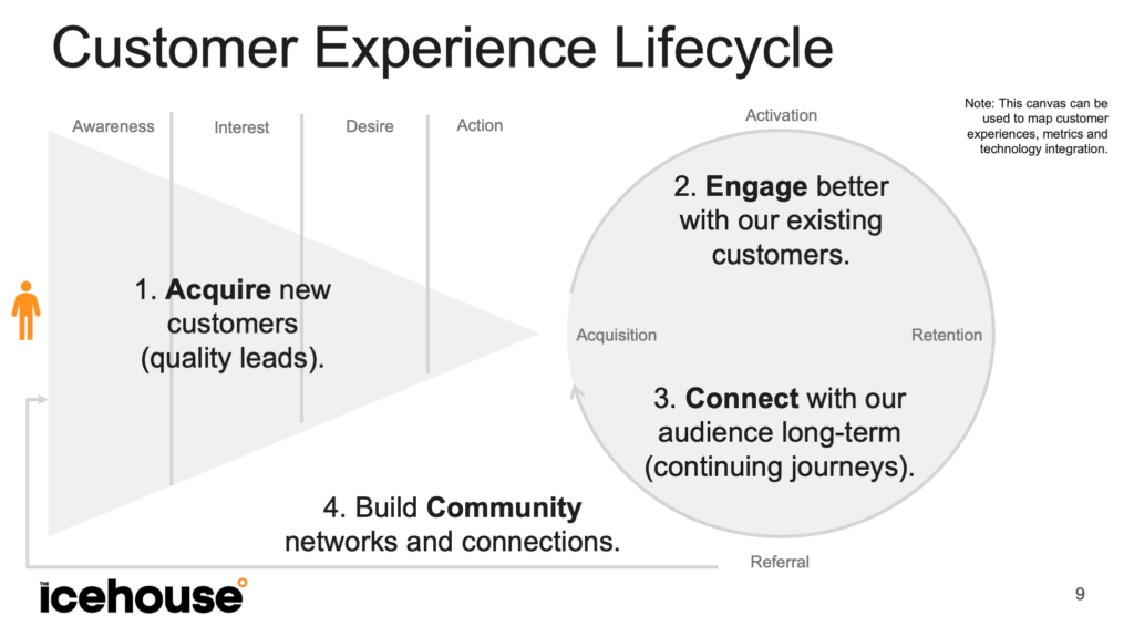
Customer Experience Canvas
The tool I used to map and diagnose digital customer experiences throughout the full customer lifecycle is the Customer Experience Canvas. The CX Canvas combines a pretty standard marketing funnel (based on the AIDA model of awareness, interest, desire and action) with a CX Flywheel (similar to the one proposed by HubSpot with stages for acquisition, activation, retention and referral).
There are several potential layers to the canvas depending on the project and intended application:
Experience: The surface layer of the funnel and circle can be used to map the digital touchpoints a customer interacts with throughout their experience of your product. Making these experiences more connected and efficient is a key part of digital transformation.
Data: The same canvas can be used at a deeper level to map out the data used to measure and track the experiences. The metrics we use across the whole lifecycle are based on Dave Mclure’s ‘pirate metrics’ (so called because the acronym is AARRR): Acquisition, Activation, Revenue, Retention and Referral.
Technology: Even deeper, the canvas can be used to map the technology stack and systems integration work required to deliver a seamlessly connected customer experience. This layer looks at the syncing tools, triggers & events and APIs needed to make the whole system work together.
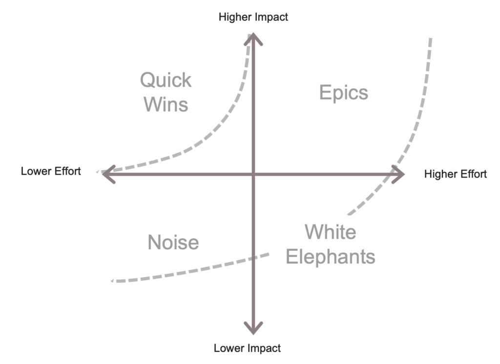
Agile Project Prioritisation Matrix
In 2001, as a reaction to traditional engineering project management techniques (that had been optimised for construction projects), a group of software developers proposed the ‘agile manifesto’. This approach to software development prioritises speed, simplicity and efficiency. There are lots of tools and techniques from agile that can be applied to an organisation wide push for digital transformation.
I’ve found that most companies undertaking digital transformation end up with a giant todo list and no practical ways to have shared conversations about prioritisation. One of the best tools to reach agreement on prioritisation is the Agile Prioritisation Matrix.
When considering a whole of company digital transformation it can be an overwhelming task and it’s hard to know where to start. The agile project prioritisation matrix breaks projects down by:
Impact: Potential return on investment, improvement in customer experience, etc
Effort: Likely expense, time and complexity of implementation.
Projects that are high impact and low effort are quick wins and should be done first to build momentum. High impact and high effort projects are called ‘epics’ and are important to tackle but take time to finish. Whether easy or hard, lower impact projects should be avoided where possible.
Digital Transformation Checklist
Having mapped the customer experience and prioritised the key projects, it’s also worth checking that you have all your basic tools in order so nothing gets lost. Boiling all the strategy down, I’d still suggest checking these basics are in place:
Production: Invoicing, production and shipping software.
Service: Customer Feedback System such as NPS surveys.
Operations: File storage, knowledge management and internal instant messaging.
Across all of these, it’s essential that your CRM can act as more than just a sales tool and provides enough APIs and/or syncing tools to eventually act as a centralised customer data platform. Because in the end, having your customer data centralised in one place is the most important part of providing a seamless digital customer experience.
You can learn more about digital transformation in a podcast I did with Bryar Stewart from the Icehouse team:
Laracon is an ongoing series of conferences and events about the Laravel software development framework. We use Laravel pretty heavily at Icehouse Ventures because it powers our Investor Portal. I’ve learned a lot over the years from the various Laracon conference recordings. The topics range from basic coding best-practises to advanced systems architecture, database design, all the way through to user interface design. The talks I get the most out of switch between broad theoretical best practises but then back it up with practical live coding examples. I’ve made a list with a few of my favs and some notes on how they influenced view of what’s possible with Laravel…
SOLID Design Principles
This talk with Katerina Trajcevska covers the basics of the SOLID coding principles. SOLID is short for:
Single responsibility principle,
Open-closed principle,
Liskov substitution principle,
Interface segregation principle, and
Dependency inversion principle.
The SOLID jargon can seem heavy at first, but it actually fits nicely into good Laravel coding practises and Katerina lays things out simply and clearly.
Curing the Common Loop
This talk probably changed my approach to coding more than any other talk. The idea of using chained functions, scopes and collections aren’t that revolutionary by themselves, but seeing Adam collapse whole pages of complex nested code into a single line is just magical. The elegance, power and simplicity of Laravel collections when they’re used properly blew my mind.
CRUDDY by design
Another mind-bending talk from Adam Wathan. CRUD is short for:
Create
Read
Update
Delete
I do not necessarily agree with everything this talk, but the mental exercise of trying to see everything in a modern web application as a CRUD operation is a matrix shifting moment of clarity. We now heavily use Laravel’s built in “Resource Pattern” to link models, views and controllers into common CRUD functions.
Eloquent Performance Patterns
Eloquent is the data modelling ORM (Object Relational Mapping) tool built into Laravel. It’s an amazing tool, but Jonathan comes from a ‘bare metal’ background and like me, learned MySQL years before he learned to code in a modern framework. As such, he thinks in raw database queries. Laravel’s ‘Query Builder’ is the database layer that gets things from the database before passing them to Eloquent (to wrap the richness around). This talk is all about speeding up Eloquent by doing more in the database.
Laravel Performance Optimisation
Kasia Zien takes a pretty detailed and hard-core approach to performance optimisation, but it’s eye opening to see her logic for how to squeeze the best performance out of Laravel.
Software Design Patterns in Laravel
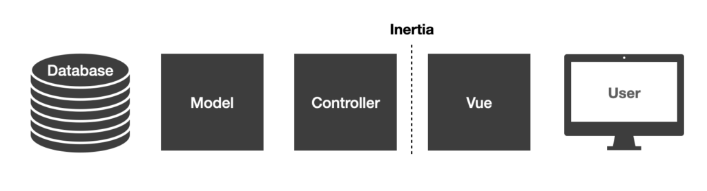
“Design Patterns” are best-practises or standard approaches to common problems in programming. Not every design pattern is a good habit (the repository pattern can over-complicate a project fast). But when used carefully, the various software design patterns make for better and more consistent code. We use the Presenter Pattern at Icehouse Ventures to tidy up data before sending it to our Vue JS front-end.
The Laravel Way
Jeffrey Way is one of the original gangsters in the Laravel community. As an OG, he’s been working with Laravel so long that he’s drawn out the broader mindset of what I think of as the “Laravel Way”.
Chasing Perfect Code
Yet another Adam Wathan talk, but honestly every one is a level-up in terms of how I write code. Adam goes through ‘code smells’ and things to tidy up. Things like nested-conditionals may technically work in a solo project or a university code exam, but in the real world our code needs to be read by other developers or by your future self. This presentation taught me to make my future self’s life easier with code that is simple, readable and clear.
Diving Deeper
One of the things I love most about Laracon is being exposed to more advanced topics in software engineering that I might not have otherwise discovered. For example:
Database Indexing – The art of indexing a database is kind of obscure, but the pursuit of fast queries and ‘groking’ database indexing stretched my mind and reminded me how much I love MySQL.
Denormalisation with Eloquent – The Icehouse Ventures investor portal calculates pretty advanced ‘professional investor grade’ maths and charts like IRR, TV/PI and other venture capital finance metrics. Many of those are too complex to run on the fly so we tried caching them. But with thousands of investors and hundreds of metrics our cache became a mess. Database normalisation saved us but also forced me to learn about cache warming and cache invalidation. This is the Laracon talk I wish I has watched before we built our Entity Stats table by hand.
Resisting Complexity – When I dive into the Laravel core code (the stuff we’re not really supposed to see and can’t edit) I’m always surprised by how small each function is. Each function does one thing, then passes it onto the next atomic unit. At first it seems wasteful, but Adam walks us through how breaking big functions into small ones makes them cleaner, clearer, more re-usable and more testable.
Clean Code – Uncle Bob invented the SOLID principals and is a legend in software development. Not Laravel specific, but a great reminder of the wider context of why clean code matters.
Design Patterns that pay off – Matt Stauffer lays out some advanced design patterns and boils them down into simple good habits for good code.
I’ve saved all these Laracon presentations as a YouTube playlist so it’s easy to find them, play them and refer back to them in the future: Laracon YouTube Playlist
For the upcoming Icehouse Ventures investor portal we chose to build the application using Laravel, which is a php framework. Frameworks like Laravel speed up the development process by providing a lot of the scaffolding that you need for a modern web app.
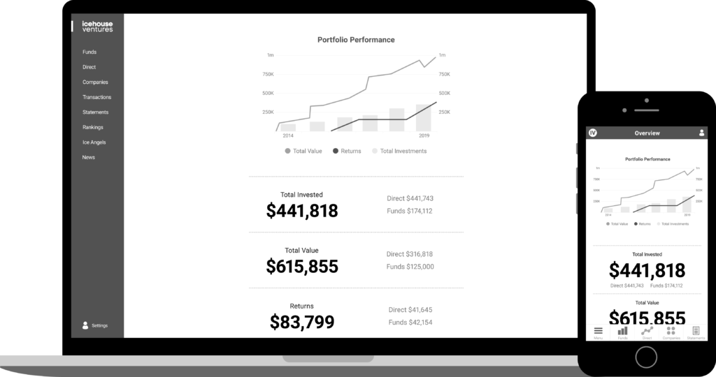
Mockup of the upcoming Icehouse Ventures Investor Portal.
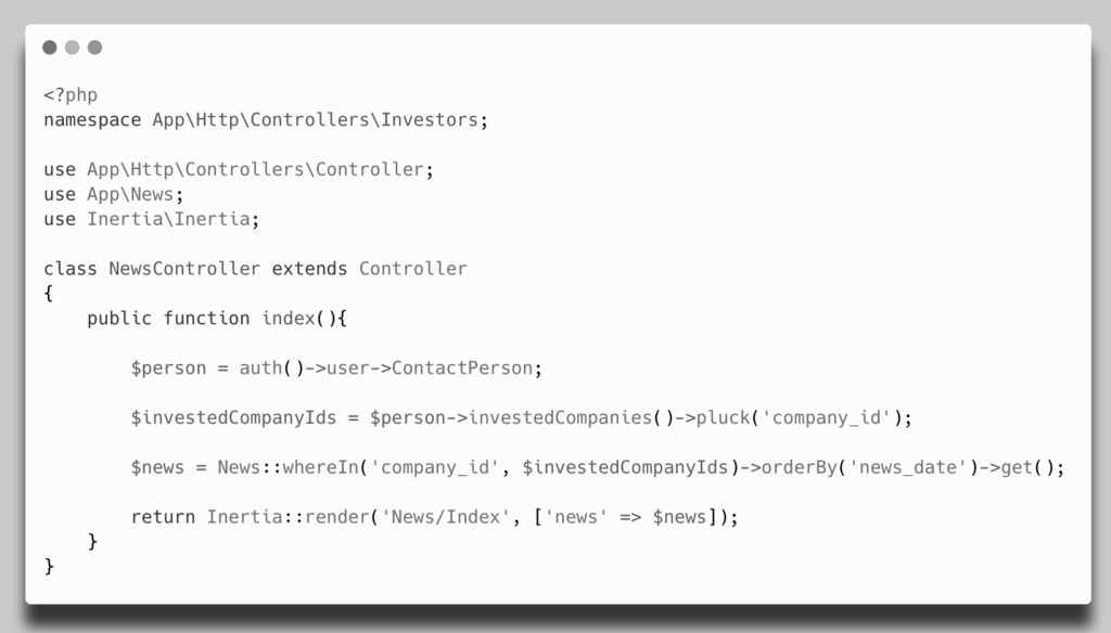
We started off looking at using off-the-shelf tools such as venture capital fund management software and various online angel network platforms. But we couldn’t find any tools that would allow us to provide combined reports that showed a consolidated view of both direct angel investments into a company and indirect fund investments into the same company through a fund the investor was a part of. Investors told us that this was a mission-critical feature so they could evaluate their effective exposure to particular startup companies in their portfolio.
We also evaluated a range of other low-code and no-code solutions such as Salesforce and various template-based databases and website builders. These were ok, but couldn’t handle the depth of complexity investors wanted such as calculating IRR over long time periods, exporting PDF statements and ranking portfolio performance against other investors.
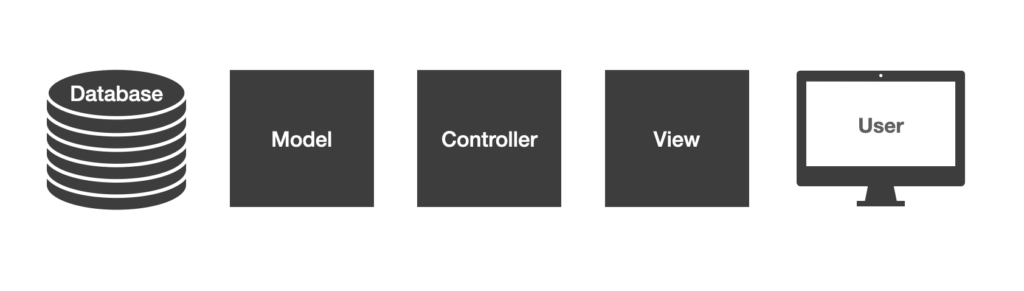
Laravel uses the classic Model-View-Controller architecture.
In the end, we chose php and in particular Laravel because of the robust stability of a MySQL database and the power of the Model-View-Controller approach to the code structure. MVC is a common pattern used in enterprise architecture to build scalable and stable software systems, the key elements are:
Model – A data model that manages your database and represents data as objects that can have relationships with other objects. For example, we have a model for Users and a model for Companies in the investor portal.
Controller – Traffic controllers that manage how data moves around your application. Controllers fetch data from the Models and send it to the Views. In Laravel, the controllers do a lot of heavy lifting in the background such as security, permissions, sorting and filtering.
View – Templates that render html and CSS for the end-user to see what you want to show them. Laravel uses a php and html template format with no JavaScript interactivity by default.
Adding JavaScript to Laravel
As much as I love php, we wanted to provide investors with a modern app-like experience. To do this we needed a modern JavaScript framework such as React (from Facebook), Angular (from Google) or Vue (an open-source JS framework). I chose Vue because it’s popular in the Laravel community, not owned by a giant tech company and is the fastest to learn for a non JS developer like me.
There are several approaches to getting front-end JavaScript frameworks to work with back-end applications like Laravel:
Approach
Advantages
Disadvantages
Single Page Application with API – The traditional approach has been to build the JS front-end as a single page application and feed the data through to the app using a private API.
By keeping things separate, it’s easy to focus on one thing at a time. Back-end developers can work on the back-end code and front-end developers can focus on the front-end code.
My experience with SPAs was that I wasted a lot of time keeping the API and the front-end talking to each other. Frustrating points included login tokens and data-table filtering. In a small in-house tech team there’s no such thing as separate back-end and front-end teams, we’re all full-stack by necessity.
Livewire – This approach allows you to use little bits of JavaScript inside your normal php templates.
It’s cool to have php everywhere and JavaScript only where you most need it. Like a modern framework approach to JQuery.
The disadvantage of Livewire is that it’s still mainly using php not JavaScript, so it doesn’t have the app-like feel of an SPA. It’s also not full-on best-practice JavaScript using Vue or React so you miss out on the Vue and React templates and resources.
Inertia – This is a new way to use JavaScript inside the MVC framework of a php app. The Model and Controller are in php and the View is in JavaScript.
Best of both worlds. Inertia lets php do what it does best (databases, models, relationships, security, etc) and JavaScript can do what it does best (render the front-end interface and provide interactivity).
Not technically an SPA. Requires some finesse to make it feel fully app-like and the progress loader is a bit clunky. Inertia puts JS right inside your php monolith so you now have a multi-language code base that might feel weird to some developers.
Livewire is a new method for using JavaScript inside a php template.
Laravel 8 was released recently and now includes both Livewire and Inertia as options for the default Laravel user interface templates (called Jetstream). This is exciting because it will expose these two new approaches to more developers. But it’s been confusing for a few developers who are used to thinking of JavaScript as a different world from php.
Inertia allowed us to use Vue JS in our Laravel app.
On balance, we opted to use Inertia for the Investor Portal because it kept our code base all in one place and allowed us to move fast and change things quickly based on user feedback. I’ve already had dozens of moments where we wanted to make a change to the way that something is displayed in the portal. It’s a true joy to be able to make a quick change to the Company model, flow it through the Direct Investments controller and have it pop up in the investor portal Vue file all in the same code-base, with easy Laravel debugging and easy feature-testing and front-end testing. By having Vue running inside Laravel I’ve upskilled quickly on JavaScript without having to go all-in on complex JS routing and data manipulation.
Notice the simple call to Inertia from the Controller. Just like a Blade template.
We also went for Tailwind CSS instead of the more established Bootstrap CSS framework. Tailwind is a utility framework approach which means that instead of single giant templates in CSS with little HTML tags you just layer lots of little HTML tags onto an element to make it look the way that you want. It seems messy at first but once you get used to it, it’s life changingly fast. Using Tailwind, Alipne JS, Livewire and Laravel is called the TALL stack and I’m calling Vue, Inertia, Tailwind and Laravel the VITL stack. (Some people prefer the name LIT for this stack but I think Vue is a vital part of what makes this approach so awesome).
Building software in-house is an unusual move for a Venture Capital fund but Icehouse Ventures has a unique approach that combines the scale of the Ice Angels network and the depth of major funds like IVX and Tuhua. Globally, the venture capital industry is being quickly re-shaped by increased investor demands for transparency & reporting and by startup founder demands for faster decision making & streamlined capital raising processes. Technology can be a force multiplier for us and having both php and a modern JavaScript framework like Vue in our toolkit means that we can move faster while still keeping things safe, stable and secure.