Using a company’s initials, in lieu of the full name, is often convenient for the internal team. But using both the initials and full name together in your branding can be confusing. Your company’s initials are like a personal diminutive. It’s usually best to introduce yourself with one name and then allow people to adopt a diminutive (as they get to know you). It’s a bit like introducing yourself as Jennifer and adding in the same breath that “my friends call me Jenny”. Leaving your new acquaintances wondering which is the right name to call you. Introducing yourself as two things at once just confuses people.
If you introduce yourself with a diminutive, the name that people use day to day will never revert back to your full name and eventually you’ll be known by your diminutive only. I tell clients not to lead with their initials unless they are willing to eventually abandon their full name. Few people remember what BP, IBM or CNN stand for. Furthermore, for a startup, the initials won’t be meaningful to your audience so you lose the benefit of your chosen name. Even BP and IBM started out using their full names and only evolved to using their initials after market awareness was established.
From The IW to Innovation Warehouse
We’ve been sharing the adventure of rebranding the Innovation Warehouse as a transparent story to let other startups learn from the experience. The other chapters are here as a live Branding Case Study. It should also be a useful case study for branding professionals as we’re sharing the experience from the strategist’s perspective, the designer’s perspective and the client’s perspective.
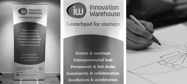
The Innovation Warehouse has been using both the initials and the full name since its launch. For the existing strategy, the term “The IW” was woven into the market positioning. For the existing messaging, “The IW” was used in online copywriting. For the existing design system, the initials “IW” are prominent in the logo.
We haven’t used “IW” or “The IW” in the rebranding. We think of “Innovation Warehouse” as the official brand name.
Removing the initials from the strategy
We’ve recommended putting “Innovation Warehouse” at the top of the brand hierarchy. Any new locations or product offers will be part of the overall umbrella brand. The goal is to reduce “namingitis”, which is the tendency of some companies to try and invent unnecessary proprietary names for every product. This is often confusing for consumers.
We have already shifted the URL from www.theiw.org to the full www.innovationwarehouse.org. Google has been notified using the Google Webmaster tools so there should be very little SEO loss. We’ll also be asking the main inbound link pages (co-working directories) to update their links to the new URL. The decision to change the URL was driven by wanting to make it easier (for someone new to the brand) to understand and remember.
The overall strategy of the project is to move from organisation-centred thinking to user-centred thinking. This goes beyond marketing and visual design and is really a shift in mindset towards having empathy for our customers (especially for new customers).
The brand strategy for Innovation Warehouse is all about attracting intelligent and hardworking entrepreneurs. To gain mindshare with this audience we need to be consistent and professional. Using the full name means that we are repeating a consistent message in every medium.
Removing the initials from the messaging
The copywriting and messaging for Innovation Warehouse is all about encouraging positive word of mouth. We think that the viewpoint of the organisation has gradually become too internally focused (because the member community has grown so successfully and is taking more and more time).
Apparently, some of the team enjoy the mystery of saying “I work at the IW” and then having to explain it. That works fine with the “first degree” of communication. But doesn’t work for word of mouth. When the initials get to the second or third degree of word of mouth, they lose their meaning. People who have never been to Innovation Warehouse are talking to other people who have also never been here, and they’re being confused by the initials.
The members currently talk about “The IW” to each other because we encourage it. Instead, we want to encourage the members (as brand ambassadors) to talk about the “Innovation Warehouse”.
Imagine an entrepreneur who has just been to an event at the Innovation Warehouse. When she goes home to her family and talks about it, she is not going to say “I’ve been to the IW…”. Instead, she is going to say “I’ve been to the Innovation Warehouse…” The brand should be engineered to survive word of mouth. The best way to achieve this is through consistency, repetition and clarity.
The messaging for the Innovation Warehouse is all about participating in the wider technology and entrepreneurship community. Entrepreneurs in this environment have so many options that being memorable is the key to word of mouth referrals. In turn, consistent language is the key to being memorable. Nobody knows what “The IW” means unless they have already been exposed to the Innovation Warehouse.
Removing the initials from the design
As discussed in the brand audit, the existing logo includes both the initials and the word mark. At first, the Innovation Warehouse team asked us to include options for an initials mark in our new brand designs. But we found that (even with the best of intentions) the initials kept creating less-than-perfect design results. This week, we had a landmark meeting with the senior management team, to agree whether the initials needed to be part of the brand design.
This is how the meeting went…
Klaus and I updated the CEO and management team on progress with the design work and shared the difficulties we were having incorporating the initials into our design concepts.
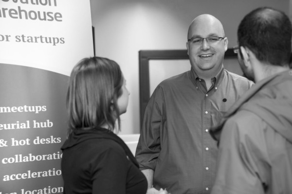
The CEO, Ami, leaned back in his chair thoughtfully and looked at the pull-up banner out in the co-working space (which has both the giant lozenge and the word mark). Then he leaned forward, looked us straight in the eyes and said:
I’m not sure that any visitor, when they look at that banner, even notices that it says “IW”. I think that they just see the “Innovation Warehouse” and a squiggly thing next to it. If you want to drop off the initials from the designs, go ahead.
As Ami settled back into his chair, Klaus and I looked at each other and thought, “Hold on, that was too easy.” Ami had instantly understood why we recommended killing off the IW. We’d been advocating for some time to think from the audience’s perspective so it was like a breath of fresh air to hear the CEO really take our advice on board.
There was a moment afterwards when Ami said, “Are you guys saying you want to kill off the IW entirely?” Klaus (in the way that only Klaus can), let the question hang in the air for a couple of seconds before saying:
Yes, we are killing off the IW. That is what we recommend.
We all sat silently for a couple of seconds in the boardroom and let it sink in. Then we strode out of the room, called the design team and let them drop the graphic elements that referred to the letters “IW”. The team breathed a sigh of relief and pressed on to the next round of design concepts.
Follow the rebranding process on the Innovation Warehouse’s team blog, Klaus Bravenboer‘s blog and on this site. You can add your input into the branding process by tweeting @IWLondon.